All Nonfiction
- Bullying
- Books
- Academic
- Author Interviews
- Celebrity interviews
- College Articles
- College Essays
- Educator of the Year
- Heroes
- Interviews
- Memoir
- Personal Experience
- Sports
- Travel & Culture
All Opinions
- Bullying
- Current Events / Politics
- Discrimination
- Drugs / Alcohol / Smoking
- Entertainment / Celebrities
- Environment
- Love / Relationships
- Movies / Music / TV
- Pop Culture / Trends
- School / College
- Social Issues / Civics
- Spirituality / Religion
- Sports / Hobbies
All Hot Topics
- Bullying
- Community Service
- Environment
- Health
- Letters to the Editor
- Pride & Prejudice
- What Matters
- Back
Summer Guide
- Program Links
- Program Reviews
- Back
College Guide
- College Links
- College Reviews
- College Essays
- College Articles
- Back
Battle of the Brews
There is one place early birds go for their morning fix, and only one. (No, 7-Eleven does not count.) Competing on the very opposite ends of the Plainview Shopping Center, two coffee shops brawl it out each day from sun up to sun down, serving endless customers their goods. However, the goods have proven to be sweeter at Starbucks, attracting more of a crowd due to their portrayal of stylish, sleek advertising and ambiance compared to Dunkin’s run-and-go feel.
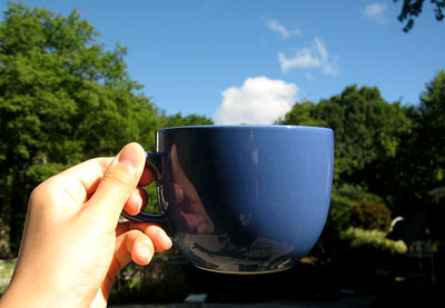
Believe it or not, the cup size names greatly effect the coffee lover’s attraction to each respective shop. Dunkin Donuts keeps their size names to one language: small, medium, large. Not too hard. Starbucks, on the other hand, hops across three different countries: Spain, Italy, and just so they always keep a part of them back at home, the United States. We’ll start off in our home country with “tall.” Normally, when I think of tall, I think of Michael Jordan, or the empire state building, or something actually tall…Not a five-inch tall cylinder. “Grande” translates to “big” in Spanish and “venti” translates to “twenty” in Italian. Overall they serve a tall size, a big size, and a twenty size. But do not be too shocked by this blasphemy: the “venti” actually means the cup is twenty ounces. But why would they do that with only one size? Am I missing something? Does “grande” mean “eight?” Looking deeper into these minor aspects of companies is thought provoking as to how so many people are used to and can be fooled by such insensible ideas when the ideas are displayed as impressively as Starbucks displays them.
In addition to impressing their customers with foreign languages, color theme is a very important choice, as well. Although both stores use white as their base color, they later veer completely off the similar path on the color wheel from one another. Donned in pink and orange, the rather large and clear font of “Dunkin Donuts” normally seems to stand out against a competitor. However, Starbucks’ deep green circle containing an exotic crowned woman even makes you think for a minute as to what this woman represents to the company and why. (I know, thinking at a coffee shop? Who would ever…) This naturally appeals to a vastly larger number of coffee grind guzzlers, attracting them into this proclaimed java palace without second thought.
Aside from the previous, Starbucks and Dunkin Donuts have one huge difference: their customers. Even the most loyal of customers seem to practically run in and out, grabbing their “large regular, light and sweet,” zooming past the half clean, half unclean tables and disoriented chairs. At Starbucks, things run a bit differently: anybody who walks in is generally wrapped up in the most stylish of gear (perfectly wrapped scarf, half peeking through the jet black trench coat and the occasional hobo half finger-covering knit mittens). These people, on the other hand, are also looking to stay for more than a few seconds and hang around the comfortable, inviting lounge area where you can take your time and enjoy the view through the serene, greenhouse-like windows.
Learning from experience, many people test out both Dunkin Donuts and Starbucks to try to receive a vibe from one in particular. Well, those people are crazy. Anyone who has any determination whatsoever to persuade their friend to support a coffee shop will do so for Starbucks and their welcoming, kick-back feeling. Apparently, not everyone “runs on Dunkin.”
Similar Articles
JOIN THE DISCUSSION
This article has 0 comments.